Experimenting with Instructables and Make Projects

I’ve started posting more pieces about projects I’m working on to this site. If I’m going to spend a weekend or longer figuring out how to do something, I figure it’s worth sharing what I’ve learned with others. You can find this stuff under /making. One of the first things I’ve shared is a set of instructions on how to make a photography lightbox. It’s a good project that lots of people would find useful. The design is pretty solid, and the instructions, I think, are good.
This is a fairly low-traffic site, so posting instructions here doesn’t give them much exposure. However, there are dedicated projects sites out there, which are designed for exactly this kind of material and are destination sites for people wanting to learn how to make stuff. So when it came to making a revised version of the lightbox, incorporating some improvements to my original design, I thought I’d experiment with these services, and see how they fared.
The contenders
The most well-known project documentation site is Instructables. They’ve been going since 2005, have a sizeable, dedicated staff, a marketing and outreach programme, and they’ve built up a large user base, generating a high volume of content. In the photography channel, the listing of step-by-step guides runs to 60 pages, with about 18 projects per page … so over 1000 photography projects. It’s also fair to say that the quality is pretty variable.
Make Projects is a part of O’Reilly’s expanding Make brand. I don’t know how long it’s been going, or how big it is for Make, but they seem to keep pretty quiet about it, compared to other activity like Maker Faire and the Maker Shed. And it shows. By comparison, at the time of writing, their photography section has only 14 projects.
I wrote up my notes on the revised lightbox, set up accounts on both sites and submitted the same set of instructions and images to each. You can find them here:
Here’s what I found…
Contributing a project
The process of adding a project to Instructables is fairly straightforward. It’s step-based, with a rich-text editor for each step, and the ability to upload several images to illustrate each step.
They have Flickr integration, but they just copy the images to their own servers (applying massive compression in the process) rather than linking to the originals on Flickr. I can only assume they do this so they’re not reliant on Flickr for content availability, but to my mind the trade-off isn’t worth it. And the compression looks terrible.
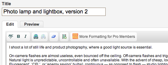
The text editor has a small button encouraging users to ‘go pro’. Sign up to a pro account for $20-$25/year and one of the benefits is more editing features. It strikes a sour note with me: I’m creating value on your platform, and you want me to pay for unfettered tools to do it? No thank you.

Adding a Make project is substantially similar at the project level: you create steps and populate each one with content. But at the step level, they adopt a different approach. The content is highly structured, with each paragraph treated as a separate object. Which makes it a pig to add a complex project with many steps. It’s only when I discovered the (poorly documented) batch upload feature that I summoned the will to complete my project.
The benefit of having such structured content is that they can do some clever stuff in the display layer, like linking materials and tools through to corresponding items in their shop, and allowing you to embed project widgets on other sites. Like this:
They’ve licensed their platform from iFixit, which strikes me as being a rather smart approach. And it’s in the form of a wiki, so anyone can edit projects. I don’t know how useful this is in practice. Having the technical facility there only gets you half way towards having a real community-edited site; the other half is about building the community spirit.
Licensing
The amount of investment these sites ask of their users is unusually high. Contributing a how-to project is significantly more work than posting an event on Meetup, uploading some photos to Flickr, or commenting on Facebook, Twitter or a blog. We can expect users to give a little more thought to what value they’re signing away than with the more light-touch services. So it’s interesting to see how the sites handle the ownership of their users’ work.
Instructables let you choose how you want to licence your work, though they do of course take certain rights for themselves:
With respect to Content you submit or make available for inclusion on publicly accessible areas of Instructables, you grant Instructables the world-wide, royalty free, perpetual, irrevocable, non-exclusive and fully sublicensable license to use, distribute, reproduce, modify, adapt, publish, publicly perform and publicly display such Content solely for the purposes of providing and promoting Instructables.
I’m not a lawyer, and I don’t play one on TV, but I think this is pretty much what they need to say in order to publish your content on their site. But it does look like they could, for example, publish a book of Instructables without the permission of contributors, and without paying royalties. If so, I’d have preferred it if they’d been a little less expansive.
To submit a project to Make, you have to agree to a Creative Commons Attribution Share Alike license when you sign up. No surprises when you consider who’s behind the site, and possibly the only viable licence for content shared on a wiki-based platform.
They are equally free to use your work commercially, and of course, both sites profit from your efforts, running advertising next to the content, promoting other products (Make) and selling memberships (Instructables). That’s fine by me, though I find the advertising on Instructables utterly distracting.
The morning after the night before
Within 12 hours of posting my project on Instructables, I received the following email:
`Hi Andrew Sleigh!
Your Step by Step Instructable “Photo lamp and lightbox, version 2” was just featured by one of our editors!
Being featured means we think you are awesome. Keep up the great work!
http://www.instructables.com/</p>
Eric
Founder and CEO of Instructables`
I can’t deny this gave me a warm glow of appreciation, but I suspect that, not only did Eric not write to me personally, but there is some programmatic help going on here. Whether they automatically ‘feature’ all first-time submissions, or they feed into site admins’ priority lists for review, I imagine the software is designed to help give newbies a little morale boost. Within a few hours, I received another email with a promo code for 3 months free ‘pro’ membership, as thanks for “writing an awesome Instructable”. This was clearly automatically triggered.
This is all accepted good practice when designing community platforms. Personalised content, rewards to incentivise good behaviour, etc. But in 2011, I think platform designers need to be more sophisticated when they employ such tools.
Software platforms (especially CRM systems) are now able to deliver highly personalised content at scale. But the promise for organisations that they can have personal relationships with large audiences — managed at low cost, by software, not humans — is a false one. We are now increasingly able to discriminate when we are being addressed or rewarded by software, and it creates dissonance, not relationships.
If a user receives a benefit because their activity meets some criteria baked into the system, and that benefit is delivered by the system, rather than a personal, human intervention, then it should be presented as such. And system designers should understand that software-based incentive models are not a substitute for real human contact, no matter how well they scale.
And if, in this case, the work is being done by humans, who really want to show appreciation for what I’ve contributed, they could do a better job of not appearing to be software.
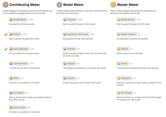
Make, on the other hand, make no attempt to be warm and cuddly. They have a system of [badges](http://makeprojects.com/Badges), which community members can earn by meeting certain criteria. Another well-worn approach to online community design, and it’s clear to everyone (I hope) that they’re purely algorithmic. I’ve been ‘awarded’ the Initiator badge, for “starting a guide that gets 500 views”. Which is fine, but again, no substitute for a real human commenting on my project.
 I had a flurry of emails from Instructables as people commented on my project, and both the comments and the notifications were welcome. I felt like my time had been well-spent — people were looking at my project — and I was connected to the Instructables community.
I also received one slightly snarky comment, which I flagged to the site admins, and I noticed today that this has been removed. That’s good community management, carried out by humans! +1!
I’ve not heard a peep from Make Projects, nor have I had any comments on my project. If people are finding some value in it, I don’t know about it.
### The bottom line
The two sites have slightly different ways of rating and interacting with projects, though they both track views. After about a week, I’ve had:
* On Instructables: 2086 views, 4 ratings and 2 comments
* On Make Projects: 1,691 views, no comments, no likes, 1 confirmed success
The vast majority of this activity happened in the first 24 hours, when I guess my project had most visibility.
Traffic referred to this site has been negligible, though there have been 30-50 views of each photo in the [corresponding Flickr set](http://www.flickr.com/photos/andrewsleigh/sets/72157626612325187).
### Overall impressions
In a word, good. The experience of contributing was relatively painless, and I had good exposure on both sites in return.
Make Projects is the closest to an open, community-run wiki for projects, which is what I had in mind as an ideal when I started this experiment. Of course, it’s not open, it’s run and owned by O’Reilly. The trade-off is that it’s also supported by O’Reilly, and has the backing of the Make brand, which counts for a lot in practice.
But I don’t get a sense of community on the site; it doesn’t feel particularly collaborative. And I think that’s their big opportunity area. Make have a fantastic brand, and a presence that crosses multiple platforms. I’d like to see them build Make Projects into a key part of their offering, in the way that Maker Faire has become such an engaging, successful series of events ([cough, cough](http://www.makerfairebrighton.com/)).
Instructables is a much more noisy, messy place. It reminds me of MySpace back when that was _the_ social network. It feels like there are people working behind the scenes, and people using it. There’s a sense of community and activity which is critical for a successful content sharing site.
But some of their design decisions, and the way they monetise their audience leave a sour taste. They’re right to address profitability head on. They’ve built a platform, attracted contributors, aggregated their content, and now they’re selling advertising and site memberships off the back of it. More power to them. Personally, though, I’d like to see them adjust the model. Flickr, by comparison, have a better balance between the value they offer, and the value they extract, from users. They could also benefit hugely from some work on the user experience.
I’m going to keep an eye on both platforms, and I may well contribute more, but I’ll continue to post here, and elsewhere. I won’t be using either of these sites as my primary project sharing platform just yet.